Well Assembly Documentation

Welcome to the Well Assembly Designer

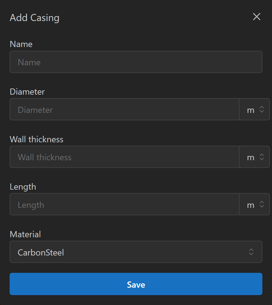
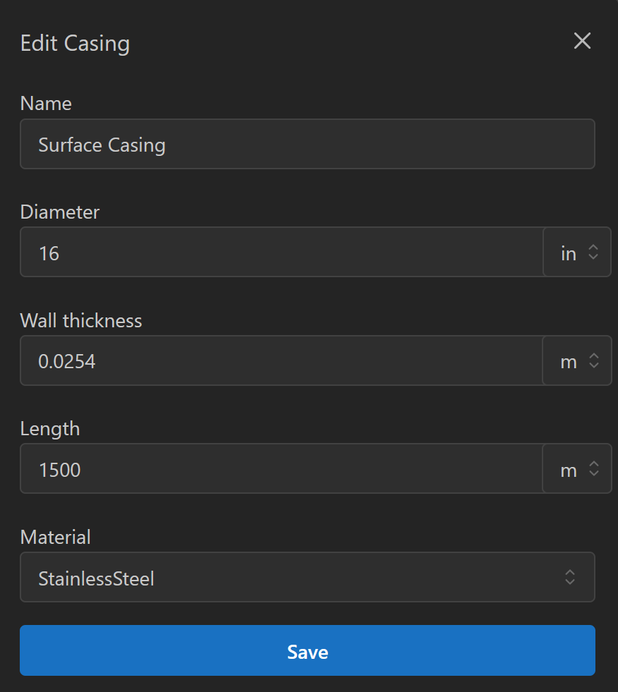
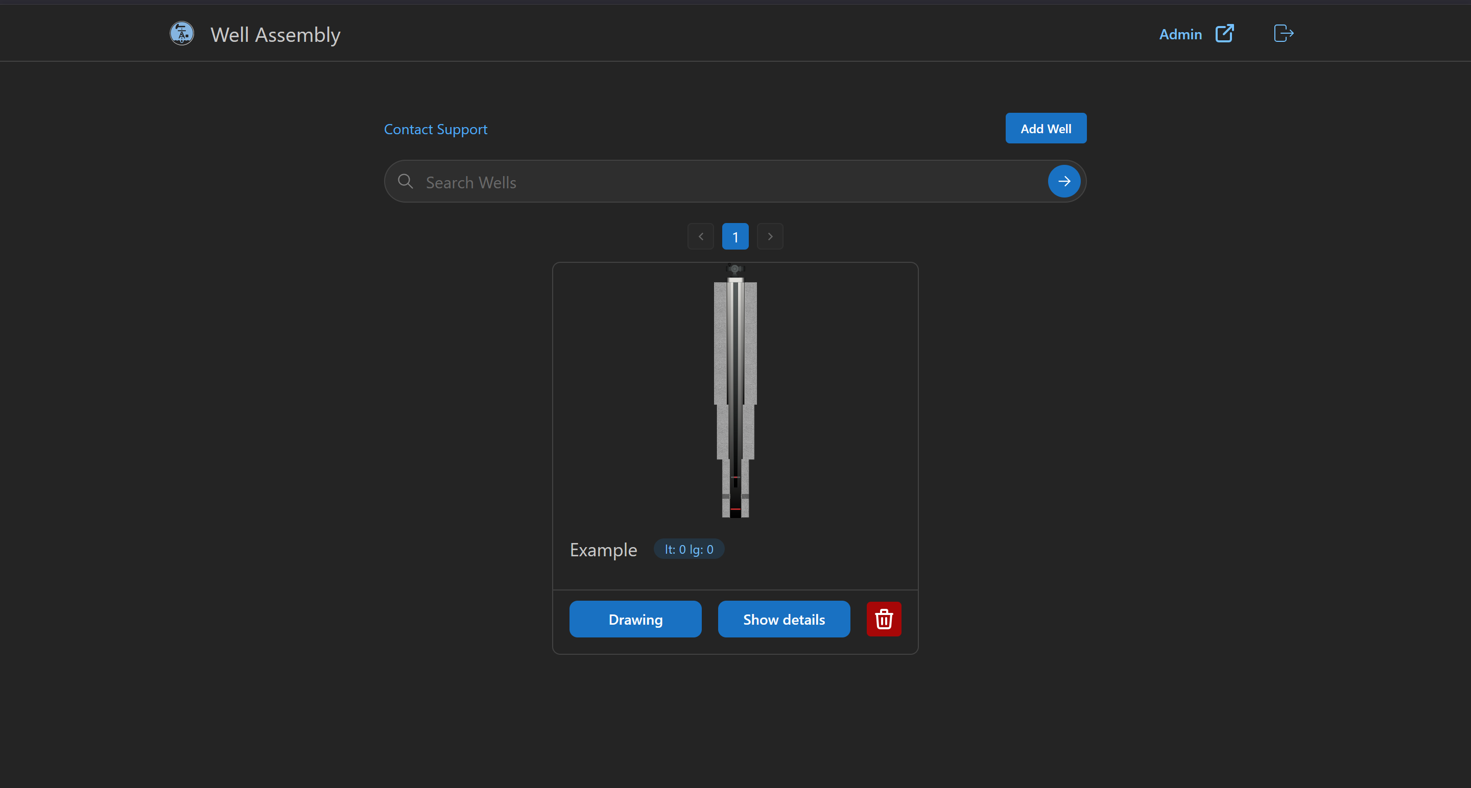
The platform allows you to design and visualize oil and gas well schematics with precision.
You can create multiple wells, each with its own name, latitude, longitude, description, and an associated schematic drawing.

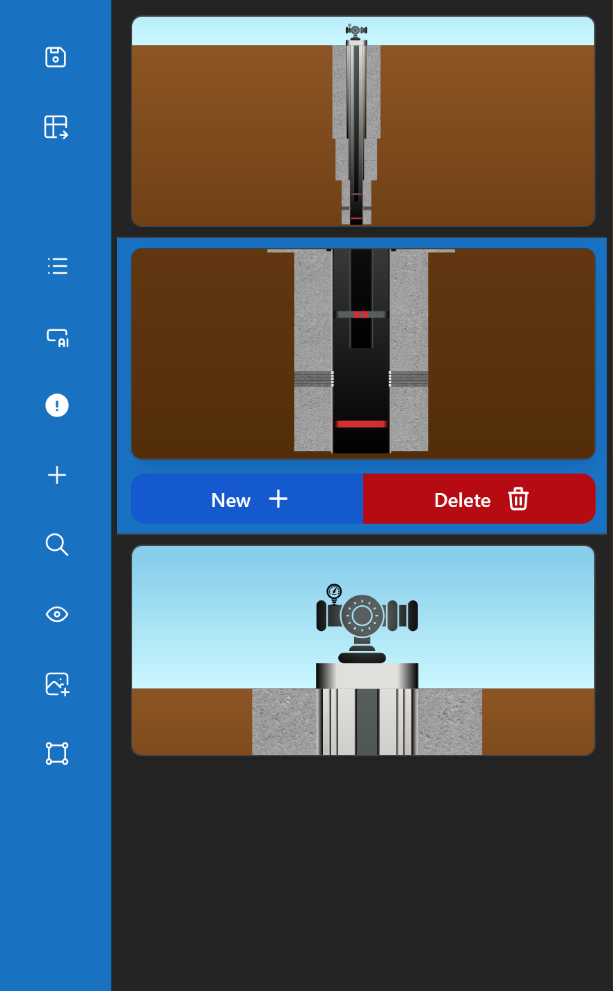
On the main page, you will see a list of your wells with the option to create new ones.
Clicking the drawing button opens the design panel, where you can view or edit the schematic.

Screenshot of wells list with create button

Lateral Menu Options

The left sidebar provides quick access to the main controls of the schematic editor:

  • Save – Save the current schematic. Unsaved changes are lost when closing the page.
  • Export – Export the current design sections into an .xls file.
  • Component Control – Toggle the component tree panel on or off.
  • Ask AI – Open a prompt window to instruct an AI agent to modify the well structure.
    (Note: no memory is preserved between prompts.)
  • Error List – View warnings and errors related to the current structure.
  • Component Menu – Access a list of predefined components to add.
  • Scale – Open scale settings to directly adjust design parameters.
  • Views – Manage multiple viewpoints with different scales.
  • Upload Image – Insert an external image into the design.
  • Shapes – Add simple shapes (e.g., rectangle).
Annotated screenshot of the sidebar

Top Menu Options

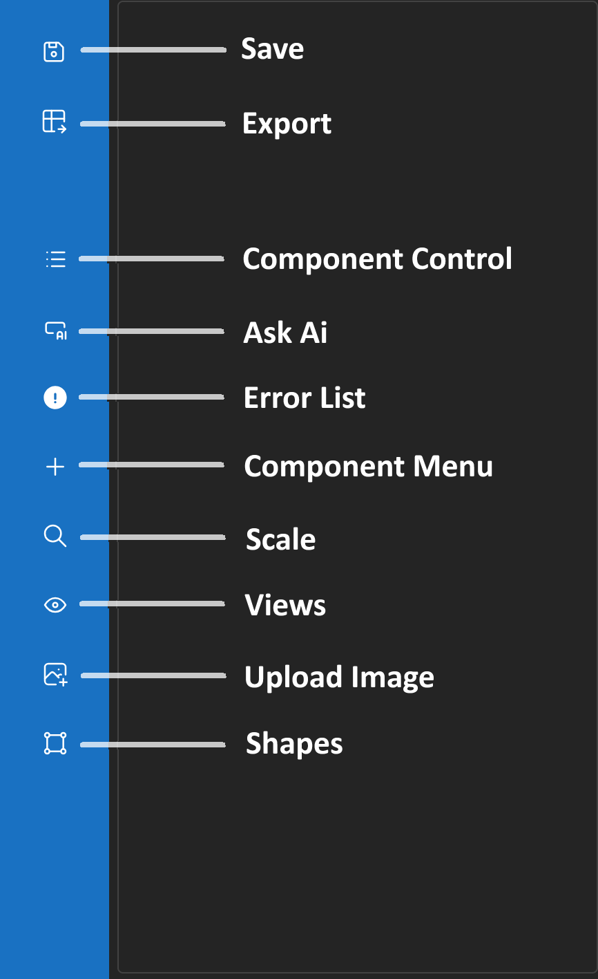
The top dropdown menu provides editing shortcuts:

  • Switch Modes – Toggle between view and edit mode.
    Holding Ctrl temporarily switches to the opposite mode.
  • Depth Rule – Show or hide the depth line with real depth markings.
  • Undo – Revert the last change.
  • Redo – Reapply the last undone change.
Illustration of top menu dropdown

Component Control Panel

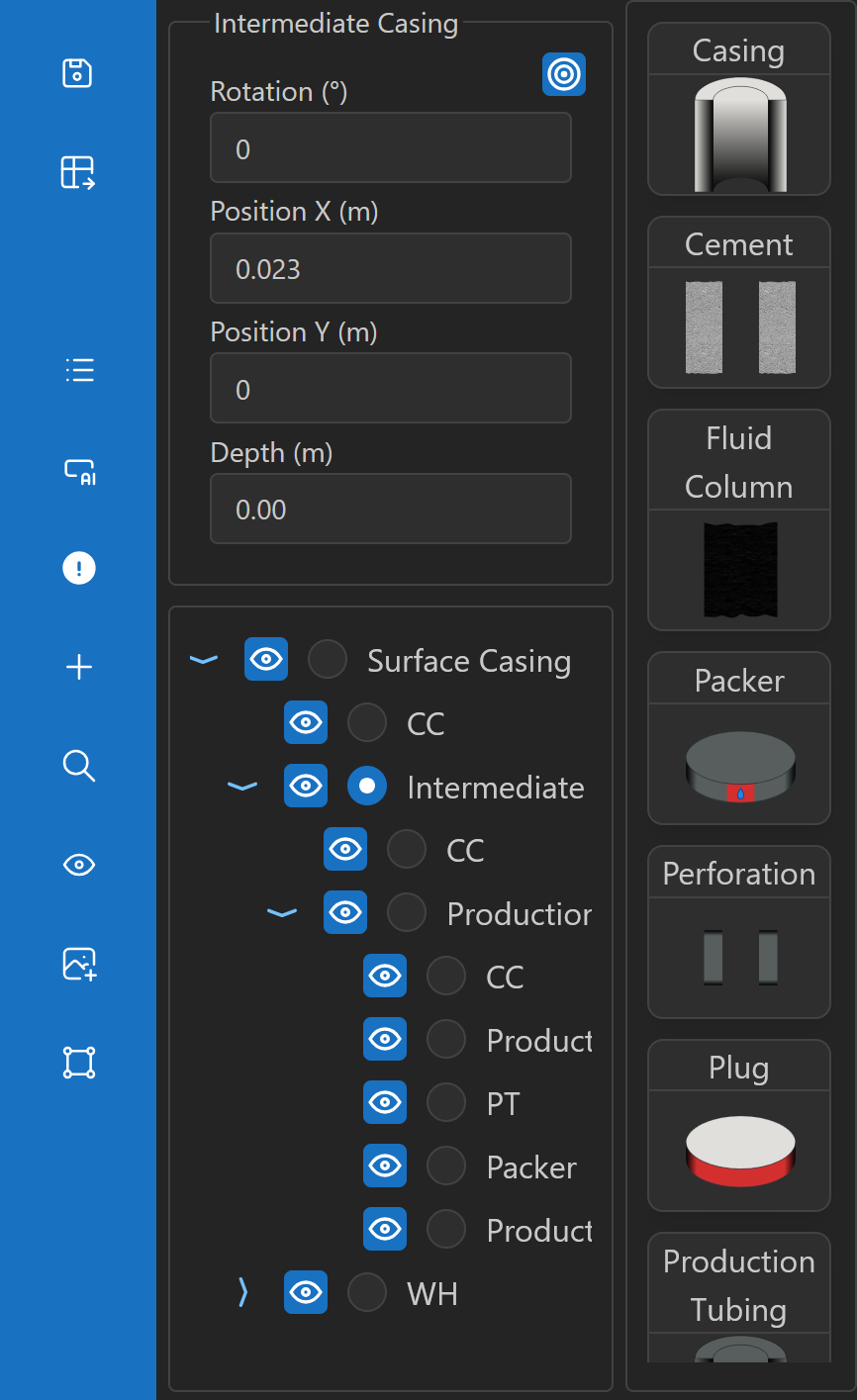
The Component Control panel displays a tree of all components in the schematic:

  • The currently selected component is highlighted.
  • Above the tree, a panel shows position properties relative to the parent and a button to center the component on screen.
  • Hovering over a component highlights it in red in the design.
  • Right clicking a component gives the option to delete it.
  • On the right side, thumbnails of possible components to add appear depending on the selected type.
Component tree with highlighted selection

Error List

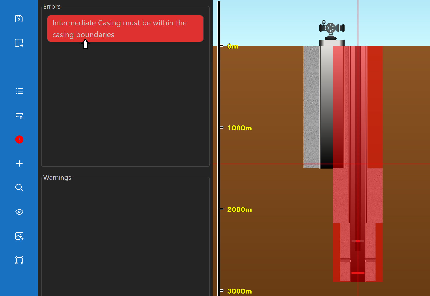
The Error List panel shows all errors and warnings in the current structure:

  • A project cannot be saved if errors are present.
  • Hovering over a list item highlights in red the component(s) causing the issue.
Screenshot of error list highlighting components

Scale Settings

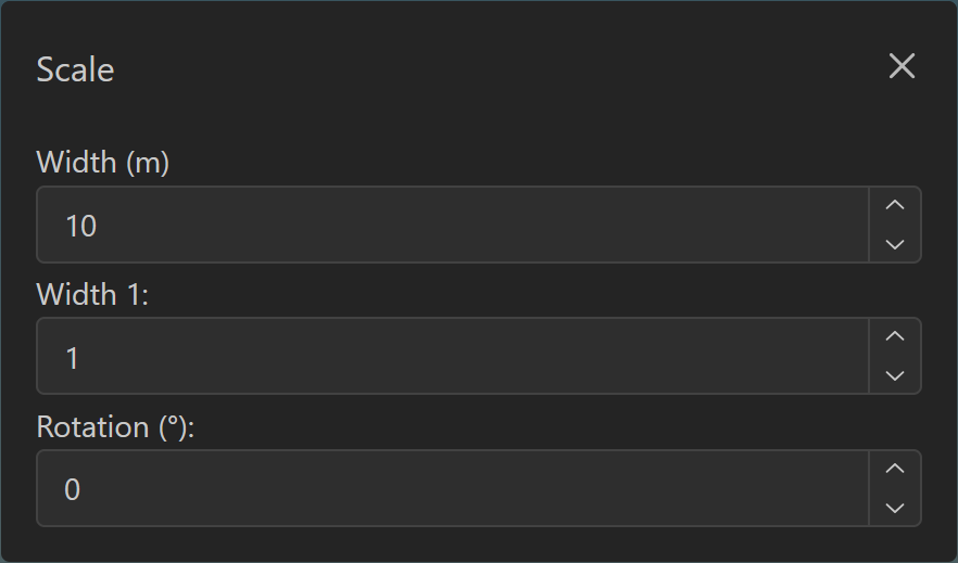
Control the schematic scale with three parameters:

  • Width – Defines how many meters the drawing area width represents.
    Adjustable dynamically with zoom gestures.
  • Width Factor – Defines how many design meters correspond to one real meter.
    Adjustable with zoom gestures while pressing Alt.
  • Rotation – Rotation angle (in degrees) of the design.
    Adjustable with zoom gestures while holding Ctrl + Alt.
Dialog showing scale controls

Views Management

The Views panel manages different perspectives of the schematic:

  • New – Create a new view identical to the current one Shift + N.
  • Delete – Remove a view (only if more than one exists).
  • Switch – Click a view or press Shift + Tab to change perspectives.
UI showing multiple views thumbnails

Upload Image

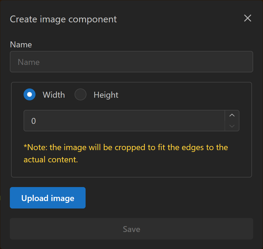
You can insert an external image into the design:

  • Specify width or height in meters.
    The other dimension is calculated based on the image’s aspect ratio.
  • The image is cropped to remove empty transparent spaces.
Dialog showing image component properties

Design Area Interactions

The design canvas supports different behaviors depending on the mode:

View Mode

  • Click and drag: change viewpoint (horizontal and depth).
  • Shift + Arrow keys: move the viewpoint by the current scale’s pixel equivalent.

Edit Mode

  • Click: select a component under the cursor (or deselect if empty).
  • Right-click: open a menu with available actions for the component.
  • Drag selected component: reposition it within valid areas.
    Holding Shift allows dragging even if you didn’t click directly on it.
  • Shift + Arrow keys: move the selected component by one pixel in the current scale.

Adding and Editing Components

Adding Components

  • Add via Component Control panel or right-click menu.
  • A dialog requests the component properties.
    Press Enter or Space to place it at the nearest valid position to the cursor.
  • Components can also be added through the AI agent, where properties and position are inferred from the prompt.

Editing Components

  • Right-click a component → Edit opens a dialog with editable properties.
  • Selected components may display anchors to adjust width, height, or rotation.
  • AI prompts can also be used to edit existing components.
Dialog showing adding component properties
Dialog showing editing component properties